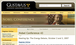
We’ve made some noticeable modifications to the Gustavus template recently. The changes were made to address various minor issues, the foremost being usability problems in the “seach/go quickly to…” area of the header.
Simple, comprehensive searching
 Where once we had a “go quickly to…” menu, search box, and search menu, we now have one simple search box. We have also drawn a clear visual distinction between the passive “logo” area, and the active “search” area. We’re hoping this will seem less intimidating and encourage visitors to take advantage of the search.
To further augment this change, the search function will now deliver results from the website in general, as well as the gribly, calendar, blogs, and academic catalog. For many users, this one “super search” will eliminate a number of unnecessary steps.
Global navigation revamped

The “go quickly to…” menu has moved to the global navigation (yellow bar) under the “more” button (hover over the more button to see the list). This, again, was done to simplify the search area in the header, and also to further emphasize these frequently accessed areas of the site. The global navigation bar has also gained an “alumni” link, and we’ve reordered the items alphabetically (except for the “more” menu, which, because of its behavior, needs to remain somewhat distinct).
Footer clarity
 The redundant global navigation in the footer area has been removed to allow for an enhanced audience-oriented navigation bar, and the various other footer bits were very clearly separated from the navigation area. This should draw more attention to this often overlooked, but nonetheless important, user-centric element.
Help us improve
Overall, we’re confident these updates will prove beneficial. In the meantime, we’d love to hear your feedback.

Leave a Reply
You must be logged in to post a comment.