Each year Web Services is handed the task of creating a website for the Nobel Conference. This site is intended to provide accessible information to be used in the publicizing of the Nobel Conference. Designs for this site in the past have maintained the look-and-feel of the poster and other promotional materials for that year’s conference.
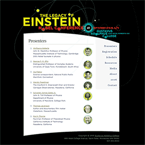
This year’s conference, “The Legacy of Einstein,” will celebrate the 100th anniversary of Albert Einstein’s annus mirabilis. Today this year’s website went live, replacing the temporary placeholder that had been there for months.
While we are pleased to announce the unveiling of this year’s website, we also want to take a retrospective look at the previous conference websites.
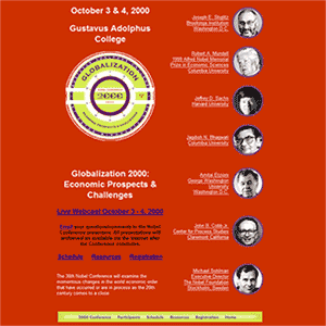
The 2000 Nobel Conference topic was “Globalization 2000: Economic Prospects and Challenges.” 2000 was also the first year that we created a special website for the conference. As you can see, the Nobel Conference website has always focused on a few key components: presenters, schedule, resources, and registration information.
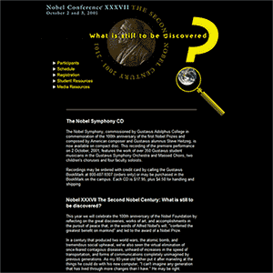
Next year, the 2001 Nobel Conference asked “What is still to be discovered?” This website, however, exhibited few changes from the prior year’s website. Most notably, the 2001 website does not incorporate the poster design. Rather, it was designed to resemble the greater Nobel Conference website at the time (and is the only Nobel Conference website to not follow the poster). Additionally, the participants were moved from the front page to a sub-page to create room for the addition of the letter from Tim Robinson, the director of the conference. The resources were also divided into student resources and media resources.
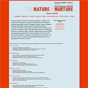
Returning to the pattern, the 2002 Nobel Conference website mimicked its poster’s theme, “The Nature of Nurture,” very closely. It also brought the list of presenters back to the front page and added a few links from previous years: continuing education, next year’s conference, and contact. Interestingly, the 2002 conference website was the first to feature the conference’s corporate sponsors.
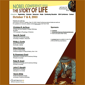
Because the 2003 Nobel Conference website basically followed the model that the 2002 website had set, there is not much to note. However, the 2003 website incorporated some more advanced web design techniques that were adapted from Eric Meyer’s slantastic found on css/edge to achieve the slanted lower right edge.
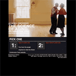
Although the topic of 2004 was “The Science of Aging,” the website did not look aged at all. Conversely, the 2004 Nobel Conference website represents a milestone in the Nobel Conference websites and the development of Gustavus websites in general. This was the first year we incorporated flash into the website as we increasingly focused on aesthetics and presentation. In addition, we provided our visitors with a non-flash version of the site which was also the first component of the Gustavus website to be 100% XHTML 1.0 Transitional compliant and used a table-less CSS design to ensure greater accessibility. It was also the first piece of the Gustavus website to implement the cool CSS rollover menu technique from A List Apart that we currently are using throughout the entire site as part of the general template. Moreover, this site was the first component of the Gustavus website to use a separate style sheet for printing (which works really well with the table-less design).
Finally, the 2005 Nobel Conference website is here. Even though 2004 was a huge step forward for us because we used flash, we decided to stay away from flash this year for a number of reasons:
- If we offer a flash site, we need to also offer a non-flash site. This forks in the site and makes updating it more tedious and time-consuming.
- Working with flash and making updates is not the easiest and quickest thing to do. Conversely, updating HTML or XHTML content is very easy and very quick.
- Even though flash is cool and the 2004 flash site is cool, we decided that the non-flash site was cooler because it still looked great while maintaining accessibility standards.
So, with that said, this year’s page is 100% XHTML 1.0 Transitional compliant and features some pretty cool CSS positioning techniques that allow us to achieve the effect of having the “orbitals” in the black background as well as behind the content and menu in the white and gray. We also kept the CSS rollover menu from the prior year and the links and content remained mostly the same.
All in all, we are very pleased with this year’s site and how the Nobel Conference websites have evolved over the past few years.
Leave a Reply
You must be logged in to post a comment.